Posts

Creative Critical Reflection

Creative Critical Reflection Question One Canva Video https://www.canva.com/design/DAE87vKRvis/meLizCXZLv6hhacFlU4_XA/watch?utm_content=DAE87vKRvis&utm_campaign=designshare&utm_medium=link2&utm_source=sharebutton Creative Critical Reflection Question Two Podcast https://www.podbean.com/ew/pb-9kuhn-12075d1 Creative Critical Reflection Question Three Prezi https://prezi.com/view/pEnfb1xJWVU5rKyYV2XC/ Creative Critical Reflection Question Four Prezi https://prezi.com/view/BYUye4PBIsf5S3o9CL9T/

Final Product

Image
 COVER TABLE OF CONTENTS ARTICLE SPREAD

Final Two Page Spread and Editing Process

Image
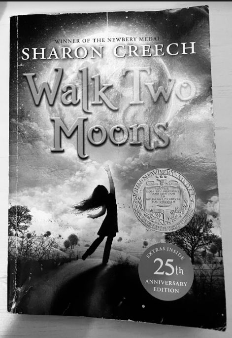
 Introduction In my previous blog, I went over a few mockups for my two page spread. I ended up choosing my second draft to create my final two-page spread with. In this post, I will be explaining how I edited the images I utilized and all of the choices I have made in the creation of my final two-page spread. I did break a variety of conventions in the creation of this spread while I did follow others. My goal overall for this two-page spread was to have it be the perfect mix of conventional and unconventional design so that my audience is always on their toes.  Images and Their Editing Process Image One I chose this picture as image one because I wanted to have at least one of my pictures display a book that I discuss within my article. I knew while designing my layout that I could be placing a picture in the section that is now labeled Tennessee, so I chose a book addressed in that section: Walk Two Moons by Sharon Creech. Before I placed it in my spread, I did make a variety of edi

Two-Page Spread Peer Feedback and Revisions

Image
Introduction In my previous blog post, I explained my final two-page spread and all of the choices I made. After finishing my spread, I received peer feedback regarding what I can do to improve my spread. In this post, I will be reviewing some of the suggestions I received and deciding whether or not to implement them in my two-page spread. My aim for this blog is to make revisions with the goal of making my final product as refined as possible. My original two-page spread is displayed below. Suggestions One and Two One of the largest issues mentioned was that I needed to add more color to my spread, a suggestion I received for this was to revert my images from black and white to color. I decided to combine this suggestion with another I received: to include a picture of Maus instead of Walk Two Moons , as I do not discuss Creech's novel much. I attempted to fix these two problems by including an image of Maus in color, aiming to kill two birds with one stone. After adding the

Two Page Spread Drafts

Image
 Introduction  In this blog, I will be going through three designs I have come up with for my two-page spread. I decided to create designs that fell across the spectrum in terms of conventionality in order to ensure that I had considered all of my options. My goal with my two-page spread design is to come up with a layout which is conventional but creative and not what a reader may always expect.  Draft One  For this draft, I decided to take an extremely conventional approach. I did some research and found a spread that I was interested in emulating. For this spread, on the top left corner, I have a drop cap letter T. The reason I have the drop cap above the writing instead of in the writing is because not only due to the aesthetics it creates but because I saw this technique used by magazines in my genre to add character to a spread whose layout may not be as dynamic or interesting. Underneath the drop cap letter is my article itself written in a column format. The reason my article i

Analyzing Magazine Articles

Image
 Introduction  In my last post, I wrapped up my table of contents, meaning that my next step is to work on my two-page spread. A focal point of my two-page spread is the article that is going to be present. In order to create an effective two-page spread, my article must be well researched and conventional. To help ensure the quality of my article, I will be analyzing a few stories in my genre for language, tone, and target audience. This will help me get a better grasp of how I should go about writing my article, making the process a bit easier. In this case, I will be using a variety of articles in order to gain an accurate understanding of my genre.  Article One The first article I chose was one from Time Magazine. It is entitled, "Far From Over: COVID 19 is worse than it's ever been in the U.S. Why aren't we acting like it?". This article is by Jamie Ducharme. It discusses how people at that time were acting like COVID 19 did not exist even though at that time, ca

TOC Peer Feedback and Revisions

Image
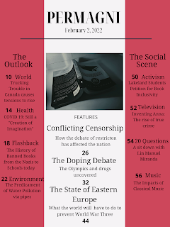
Introduction After deciding what mock up I was going to use for my final table of contents, I decided to get some feedback regarding how I could improve my design. I received a variety of suggestions with most of them focusing on two aspects of my design: the formatting of the articles and the fonts used. I decided to use some of these suggestions to see if they would work well. Suggestion One The largest suggestion I received from my peers was to edit the formatting of articles. One of the structures my peers proposed is displayed below. I was intrigued by this design. So, I tried it out in my Table of Contents. When I did so, I did change the justification of the article titles to left justified in order to  make implementing this formatting a bit easier. When I did so, my Table of Contents looked much cleaner and easy to read. I decided to keep this suggestion as a part of my Table of Contents due to its effectiveness. Not only did it improve the design of my Table of Contents as a