Two-Page Spread Peer Feedback and Revisions
Introduction
In my previous blog post, I explained my final two-page spread and all of the choices I made. After finishing my spread, I received peer feedback regarding what I can do to improve my spread. In this post, I will be reviewing some of the suggestions I received and deciding whether or not to implement them in my two-page spread. My aim for this blog is to make revisions with the goal of making my final product as refined as possible. My original two-page spread is displayed below.

Suggestions One and Two
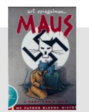
One of the largest issues mentioned was that I needed to add more color to my spread, a suggestion I received for this was to revert my images from black and white to color. I decided to combine this suggestion with another I received: to include a picture of Maus instead of Walk Two Moons, as I do not discuss Creech's novel much. I attempted to fix these two problems by including an image of Maus in color, aiming to kill two birds with one stone. After adding the image of Maus into my two-page spread, I realized that the colors of the novel went perfectly with my color scheme. Furthermore, the image was much more intentional and effective, it connected more with the content of my two-page spread. I decided for these reasons to keep this edit. This change accomplishes two of my goals, adding more color and a more relevant image at the same time. As a plus, it follows the conventions of my genre, as magazine spreads in current affairs magazines tend to have images which include color.

Suggestion Three
On the topic of color, it was mentioned by almost all of my peers. Before my attempt at adding the image of Maus to my spread, I had tried a different approach. There was a gray box behind the paragraphs regarding Tennessee. I changed the color of the box to a shade of red to see if it would look good with the design. I made the color transparent because I wanted it to blend in with the page a bit. When I did so, the color turned out to be a coral pink and did not fit my color scheme. Moreover, it looked a bit jarring and disrupted the flow of the spread. After noticing this, I decided not to include this edit as a part of my final spread because it did not improve upon my design and did the opposite instead. In addition, this does not match the conventions of my genre well so I felt no need to include this change.

Conclusion
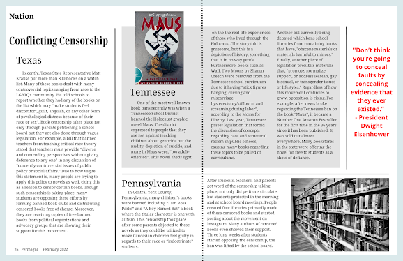
After attempting the suggestions I received, I developed a new perspective upon my design. As I explained before, I will be keeping suggestions one and two. These improved the quality of my design overall, increasing not only its effectiveness but how enticing it is to the reader. While revising my spread, I tried to include a border to add more color. I decided to add a grayish blue border to my spread, which matched the blue on Maus' cover because it helped make the design much more cohesive. Also, it broke the conventions of my genre in a subtle manner, elevating my design a bit more. Below is my final two page spread with all of the edits I have made.


Comments
Post a Comment