Colour Theory
Introduction
Color theory, at its simplest, is the science and art of utilizing color. Established by Issac Newton when he created the color wheel, it explains how humans perceive color and how colors visually mix and contrast. The basis of color theory involves the three main types of colors: primary, secondary, and tertiary colors. The primary colors are red, blue, and yellow. Traditionally, they cannot be created by combining other hues. The secondary colors, made from mixing two primary colors, are green, orange, and purple. The tertiary colors, made from mixing a primary and secondary color, are yellow-orange, red-orange, red-purple, blue-purple, blue-green, and yellow-green.
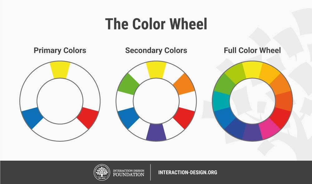
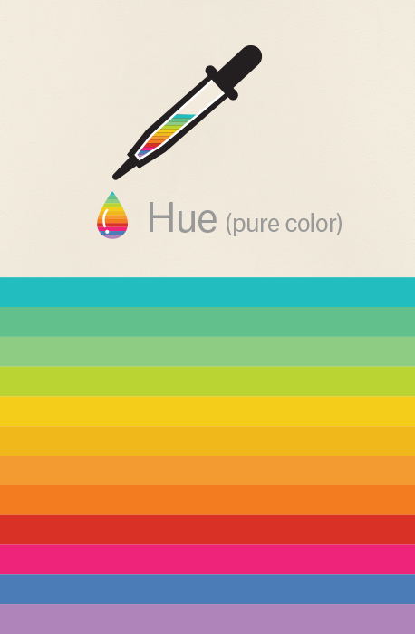
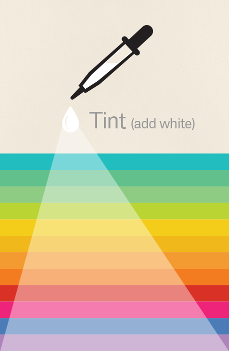
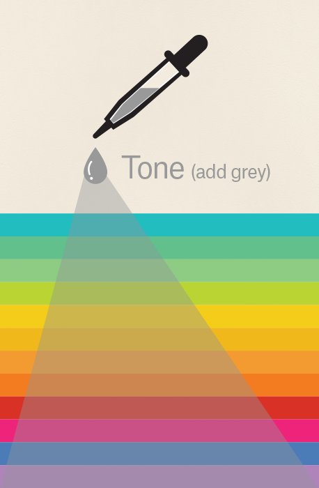
The properties of colors are hue, chroma, and lighting. Hue is how the color looks, or how it looks in its pure form. Chroma is how pure it is, whether there is shading (black added to the color), tint (white added to the color), or tones (grey added to the color). Finally, there is lighting. This is how pale or saturated a color looks. To understand color theory, it is important to know how the color wheel works. As you can see in the image above, on one side of the color wheel are the reds and yellows, basically all of the warm colors. On the other side of the color wheel, are the blues and greens, basically all of the cool colors.

Models of Color Theory


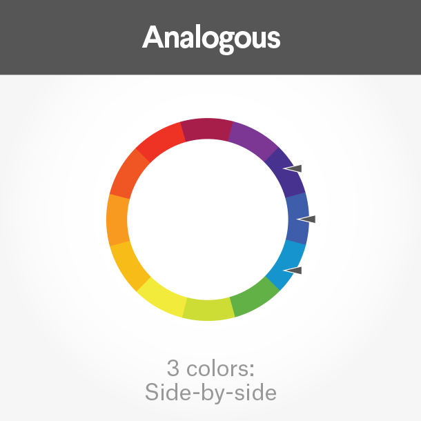
Harmony


The Meanings of Colors
An imperative part of color theory are the emotions that certain colors evoke. The emotions that color evoke have a massive impact on the way that people perceive brands and companies. In addition to the emotions that colors evoke, what they are usually associated with can make an impact on the way a viewer may perceive a design. The meanings of colors stem not only from psychological effects and biological associations but also cultural environments. Depending on the culture, different colors are affiliated with certain events and emotions. For example, in Western countries black is the color of mourning while in Asian countries that color is white. This blog will be exploring the Western world's perception of colors, including what they mean and what they incite. It is important to note that different shades, tints, and tones of a color will create different emotions. The paragraphs below will outline the basic, more simplified meaning behind each color.
Red
The color red is one that is associated with intense emotions, such as love and anger. The emotional response humans have to the color red is the reason that the phrase "seeing red" is used to describe when someone is incredibly angry. Red is also associated with power and danger, which can be seen through the use of red in stop signs. Due to the affiliation of red with all of these ideas, it is an extremely powerful color to use in branding. The boldness of red helps project strength, power, and confidence. A use of this color for its emotional connections can be seen clearly in the iconic masthead of the current affairs magazine Time. As seen in the magazine cover below, the color red is not only used in the masthead of the magazine but as a border too. The use of the color red draw's the viewers attention to the cover due to the power it is projecting. In addition, due to the associations of the colors red, a sense of desire is created in the viewer to learn more about what has been showcased and highlighted on the cover through the bold red border.

Orange
With the color orange being a secondary color, made from combining red and yellow, it mixes the emotions that both colors create. Orange combines the heat and power of the color red with the playfulness and joy associated with the color yellow. Orange is a color that is confident but not associated with luxury. It communicates activity and energy, giving off a more youthful tone. Due to this, orange is not typically seen used by luxury brands, rather by those that are energetic, youthful, and vibrant. The color orange is used by Nickelodeon, a company whose target audience is children and young teens. As seen below, the logo is a bright orange. With the target audience of the brand being the younger generation, the color orange is used to create a vibrant, fun, and youthful atmosphere. This makes marketing the brand much more efficient as just a look at the logo creates emotions that lead customers to want to explore more.

Yellow
The color yellow is one that catches the eye, but not in the way a color like red does. Being the color of the sun and smiles, it is a color that evokes happiness and joy in the viewer. It is full of positivity and hope, exemplifying youthfulness. It can also be a color that indicates caution, as it is used in life vests and caution tape. Yellow is used in a variety of brands that span across the spectrum, from Best Buy to National Geographic. One of the most iconic uses of the color yellow in branding would be in the McDonald's logo. The bright yellow m in the McDonald's logo helps create an atmosphere of fun, happiness, and positivity, one that is extremely family friendly. With McDonald's target audience being younger people and families, the use of yellow helps attract customers due to its psychological effects.

Green
The color green, seen in money, leaves on trees, and in the grass, is one that is commonly associated with nature. Linked to the growth and rebirth due to its immense presence in spring, it helps represents both stability and prosperity. With its correlation to money and nature, this color relaxes people, making them less worried about the instabilities of like. Depending on the shade, this color can represent different things. A lighter, brighter shade can represent growth while a darker one can represent wealth. Many well-known brands use the color green in their logos, from Starbucks to Spotify. For example, in the magazine cover below, the main image primarily utilizes the color green, displaying a large, rolling field full of flowers. The use of the color green in this nature-oriented scene creates a feeling of peace and prosperity, one that is further exemplified by the larger image itself. The color green, in this case, helps increase the emotions created in the image displayed as a whole,

Blue
The color blue is that of the ocean and of the sky. It is calming and serene, helping to convey both intelligence and reliability. Historically, the color blue has been associated with may different areas of life, business, art, royalty and more. Due to its historical connections, blue can also be used represent authority, such as that of the police. It is important not to forget that the the color blue can also be said to represent depression and sadness. Thus the phrase, "feeling blue" being a common one. One must remember that the shade of blue does matter as it can completely change the emotions being displayed. A dark blue can show power while a light blue can create a peaceful atmosphere. Blue is used in the logos of many companies including Lowe's, American Express, and Skype. The magazine cover below has used the color blue immensely to establish a sense of trust between the reader and the writer. With the cover story of the magazine being one regarding fake news, the use of the color blue displays that readers can depend upon the magazine and rely upon it as it is trustworthy, unlike the instances they are going to outline in the issue.

Purple
Being a secondary color that is a mix of red and blue, this color, similarly to orange, combines the emotions associated with both colors. It is both warm and cool, combing the strength and passion of red with the serenity of blue. Historically, purple has been associated with royalty with the color appearing luxurious and full of prestige. This is due to the cost of purple dye. It could only be afforded by the wealthy monarchy leading to this perception. Purple is also very mysterious and spiritual however. Monarchs were usually thought to be descendants of gods leading to the religious association. Purple is important in many religions from Buddhism to Judaism. As mentioned with many other colors, different shades produce different feelings. A lighter shade is more feminine and nostalgic while a darker one may be more luxurious. Many brands use the color purple in their logos including Hallmark and Cadbury. The magazine color below uses the color purple in an interesting yet effective way. Purple is used in the COVID 19 virus particles that dominate the cover. In this instance, the color purple creates a sense of mystery which is only heightened by the title which relates to the survival of humanity through a second wave, a situation where humanity had not clue what was to come next.

Pink
The first thing that comes to mind when the color pink is thought of is little girls and cotton candy. Pink, due to it's correlation with femininity, is a color that is inherently sweet and cute. It communicates a sense of playfulness and approachability. As always, the the intensity of the color greatly impacts its meaning. A dusty shade can be more sentimental or romantic while hot pink may be extremely youthful. Many companies utilize the color pink in their logos including T Mobile and Barbie. In the magazine cover seen below, the use of the color pink as the background of the main image creates a a sense of approachability, that this issue is a bit more light-hearted and playful. Accenting the dogs through the use of the color pink, this issue of the magazine more effectively markets itself.

Brown
Brown is a natural color, earthy, bringing to mind agriculture and the outdoors. Due to it's affiliation to Mother Nature, it, like green, creates a sense of stability and support. Brown creates a sense of warmth, tradition, dependability, and heritage. It is a wholesome color, one that gives off an atmosphere that is simple and durable, yet honest. Many brands use the color brown in their logos such as Louis Vuitton, Nespresso, and UPS. As seen in the logo below, the color brown creates a sense of warmth and tradition, an aspect that is eagerly searched for in the world of chocolate. In addition, it creates an honest yet simple atmosphere which helps further market the product as people look for comfort in chocolate.

Black
This is versatile color is one that is the most used in graphic design. It is associated with elegance and power. It is bold yet somewhat mysterious. The neutrality of the color creates a sense of unapproachability and exclusivity. Black can be sophisticated but can be connected with death and evil too. It is a color that is classic and used almost everywhere. Some brands that use black in their logos would be The New York Times, Coach, and Prada. As seen in the logo below, Gucci, a high-end designer fashion brand primarily uses the color black in their logo. Considering their status, using black sends exactly the message that they are intending, which is that they are exclusive and sophisticates, not for everyone.

White
Seen in clouds, architecture, and flowers, the color white is almost everywhere. The color, one often connected to purity, is key in minimalism. It is simple, clean, and modern being the most neutral color. It is the perfect base for more exciting, bold colors. It gives a sense of innocence and perfection. Many brands use the color white in their logos including BBC and Apple. As seen in the magazine cover below, the color white is primarily used to create a sleek yet simple look, one that is minimalistic. It creates a sense of perfection and slight innocence.

Multicolor
Depending on the colors used, different emotions can be created. A monochromatic color scheme creates style and focus while a colorful scheme creates a playful, informal, and creative atmosphere. It can indicate diversity, like in the Olympics logo. Many companies use this color scheme including NBC and Crayola. One of the most iconic uses of this can be seen in the logo of Google, which is displayed below. The multiple colors display that Google is not only inclusive but innovative, playful, and creative.

Tips, Tricks, and Technology
Use of Color Theory In Current Affairs Magazines


Works Cited
Cartwright, Bethany. “Color Theory 101: A Complete Guide to Color Wheels and Color Schemes.” Hubspot, 22 June 2021, blog.hubspot.com/marketing/color-theory-design.
Decker, Kris. “The Fundamentals of Understanding Color Theory.” 99designs, 7 July 2020, 99designs.com/blog/tips/the-7-step-guide-to-understanding-color-theory/#:%7E:text=Color%20theory%20is%20both%20the,or%20contrast%20with%20each%20other.&text=In%20color%20theory%2C%20colors%20are,secondary%20colors%20and%20tertiary%20colors.
“What Is Color Theory?” The Interaction Design Foundation, www.interaction-design.org/literature/topics/color-theory. Accessed 20 Jan. 2022.
Morton, J. L. “Basic Color Theory.” Color Matters, www.colormatters.com/color-and-design/basic-color-theory. Accessed 20 Jan. 2022.
Busche, Laura. “10 Color Inspiration Secrets Only Designers Know About.” Canva, www.canva.com/learn/color-tips. Accessed 24 Jan. 2022.
Lundberg, Anna. “Color Meanings and the Art of Using Color Symbolism.” 99designs, 10 Nov. 2021, 99designs.com/blog/tips/color-meanings.
Marshall, Sarah. “Color Meaning and Symbolism: How to Use the Power of Color.” Canva, www.canva.com/learn/color-meanings-symbolism/#blue. Accessed 24 Jan. 2022.


Comments
Post a Comment