The Psychology of Fonts

 Introduction 

Font psychology is the study of the the way different fonts affect the thoughts, emotions, and behaviors of people. Though it may seem insignificant, font psychology is key in the world of written communication. The reason font psychology is extremely critical is due to a phenomena known as the Picture Superiority Effect. This is the idea that humans are more engaged in visuals rather than the written information itself, meaning that the appearance of the font, matters more that the written content when it comes to the appearance of a brand. Using font psychology can increase the efficiency of a company's marketing and more easily influence the targeted audience in a positive manner. Depending on the type of font, different emotions are evoked in people. This post will cover four main font types, analyzing the emotions produced and the history behind it.


Vocabulary

Before diving into the depths of font psychology, it is important to look over some important concepts. Font psychology is derived from typography, the art and technique of arranging letters to make written languages look legible and appealing. An important section of typography are typefaces. These are the different families of fonts. Some well known ones are Roboto, Times New Roman, and Gotham. There are many attributes that encompass a typeface including cap height, letter-spacing, baseline, x-height, and more. These attributes also help us identify different fonts. These are variations in weight of a typeface. Some examples of fonts would be Roboto Regular, Roboto Thin Italic, and Roboto Black. 


Serif Fonts  

This style emerged in 1816 and has remained popular in the past two centuries. This is a classic typeface, one used in formal institutions and academic circles due to its conservative, yet professional appearance. This font has decorative strokes at the ends of each letter's stems, which are known as serifs. These strokes, along with the history behind this font, have led to this font style being associated with dependability, trust, formality, and intellect.  This emotional response is the reason that most universities require students to use the M.L.A. format when writing essays. This format requires students to use Times New Roman, a serif font. Some other serif fonts are Garamond, Georgia, and Palantino. Many brands use this font in an effort to incite such emotions. These include Gap, Wikipedia, Vogue, CBS News, and more. 


Sans Serif Fonts 

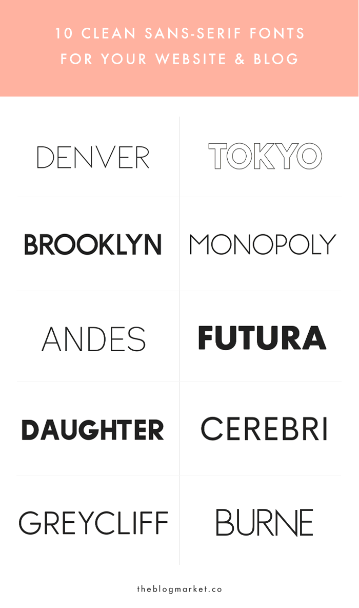
This variety, as per its name, lacks the serifs at the end of each letter's stems. Due to the lack of serifs, the letters require less space and convey a clean and clear look. In addition, the lack of serifs makes the fonts seem more approachable and friendly. This typeface came about in the early 19th century though it only became popular in the 20 century. Due to its historical background, the sans serif font family is perceived to break tradition and be progressive. This inherent perception has led to many tech and social media companies utilizing this font. To them, this is the most effect typeface as it is usually associated with the words sophistication, modern, efficient, and innovative. Many companies such as Facebook, Microsoft, National Geographic, Apple, and more use this font family in their logos and products. Some fonts that are a part of this typeface are Arial, Helvetica, and Calibri. 


Script 

This is type of font is one that is more personal as it somewhat imitates handwriting. In this category falls fonts that use calligraphy and styles similar to it. They are more casual and creative, yet elaborate and detailed. Depending on the way you use this font, you can make the viewer experience a variety of emotions, making this font style extremely versatile. This font style is usually associated with youth and the experiences of it. Due to this, script fonts are used on many products such as candy, Valentine's Day cards, and wedding invitations. In addition to this, some words also associated with script fonts are unique, elegant, whimsical, and emotional. The history of this font dates back to the 1950s when it was extremely popular in the marketing of products. This history has led many companies to use this font, to create a sense of nostalgia that connects the past and present for the person viewing the font.  Some brands that utilize this font are Disney, Coca Cola, Pinterest, and more. Some fonts that are fall into this section are Pacifico, Lobster, and Tangerine. 

    --  Some brands that use scripts fonts --


Display 

Also known as decorative, these are the outliers, the fonts that do not fit in to one of the other categories. They take attributes of other fonts and combine them in order to serve a specific purpose. They are usually used to advertise products that want to give an image of individuality. This font style is one that is used by organizations that want to be seen as trail blazing and anti conformist. Some terns that are associated with this style of fonts are original, flexible, and urban. Some examples of display fonts are Graffiti, Grunge, and Stencil. Some brands that utilize decorative fonts are Nasa, MTV, Lego, Subway, and more. 


- Some brands that use display fonts -


Why It Matters

Font psychology though seemingly pointless, plays a key role in the way we market products and perceive things. Choosing the right typeface can influence a customer's decision without them realizing. Many companies choose the fonts they use intentionally, thinking about what they are trying to achieve. This applies in all areas of written work, including current affairs magazines. Current affairs magazines tend to use serif fonts. Take Time magazine, for example. The masthead for Time, in written in the font Time News Roman, a serif font. Through the use of a serif font, Time is trying to convey that readers can trust them and that they are knowledgeable regarding the world's affairs. In general, this genre uses serifs fonts to display intellect to their readers and create a sense of trust between them. They are trying to send the message that they a trustworthy source of news. Even this blog post, is trying to do the same using Times New Roman. I, most likely, will be using serif fonts throughout this project and magazine spread in order to create a sense of trust and dependability between the viewer and I. In the end, fonts matter and affect us in ways we cannot imagine, whether we realize it or not. 


Works Cited

Fussell, Grace. “The Psychology of Fonts (Fonts That Evoke Emotion).” Design & Illustration Envato Tuts+, 16 May 2020, design.tutsplus.com/articles/the-psychology-of-fonts--cms-34943.

Svaiko, Gert. “Font Psychology: Here’s Everything You Need to Know About Fonts.” Designmodo, 22 June 2021, designmodo.com/font-psychology.

Canva. “The Definition of Font Psychology and How to Use It.” Canva, www.canva.com/learn/font-psychology. Accessed 18 Jan. 2022.

Rinaldi, Joe. “Sans Serif vs Serif Font: Which Should You Use and When?” IMPACT, 12 Nov. 2021, www.impactplus.com/blog/sans-serif-vs-serif-font-which-should-you-use-when#:%7E:text=A%20serif%20is%20a%20decorative,hence%20the%20%E2%80%9Csans%E2%80%9D).




Comments

Popular posts from this blog

Table of Contents Conventions and Sketches

Creative Critical Reflection