Final Two Page Spread and Editing Process
Introduction
In my previous blog, I went over a few mockups for my two page spread. I ended up choosing my second draft to create my final two-page spread with. In this post, I will be explaining how I edited the images I utilized and all of the choices I have made in the creation of my final two-page spread. I did break a variety of conventions in the creation of this spread while I did follow others. My goal overall for this two-page spread was to have it be the perfect mix of conventional and unconventional design so that my audience is always on their toes.
Images and Their Editing Process
Image One
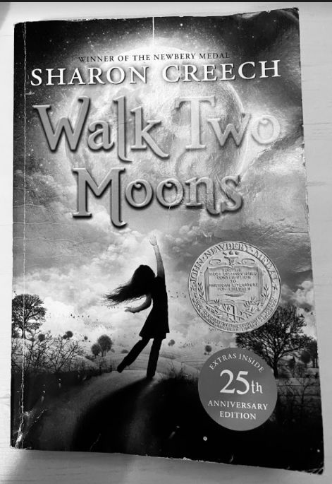


I chose this picture as image one because I wanted to have at least one of my pictures display a book that I discuss within my article. I knew while designing my layout that I could be placing a picture in the section that is now labeled Tennessee, so I chose a book addressed in that section: Walk Two Moons by Sharon Creech. Before I placed it in my spread, I did make a variety of edits in order for it to better fit my design scheme. On my phone, I utilized the editing software to do two things. The first was to crop the image so that only the book and a bit of the background was visible. This was so the image looked formal and uncluttered. The second was to place a filter on the book. I was not sure which filter to use but I knew that I wanted one that would help the image fit in my color scheme of black, white, and red. While looking through my phone, I found a filter called Noir which made the image a sharp black and white. This filter made the image much more sophisticated and well-fitting in the spread, so I utilized it.


After this, I decided to transfer my image to Canva, so that I could edit it in a more detailed format. After uploading it to the platform, I immediately started working on it. I enhanced the image using the tool Auto Enhance so that it was much clearer and sharp. I also cropped the image a bit more because I realized that having the background displayed on with the book made it look less formal and sophisticated. It did not fit the conventions of images in real magazines as well, leading me to crop it even more. Finally, as I was looking at the image, I thought that the black and white of the image still was not sharp enough. Thus, I went in search of a tool to remedy this. I then found a filter called Street which made my image just as sharp and full of contrast as I wanted it. So, I applied the filter to the image. With this, I finished editing the image and decided that it did not need any more touching up.

Image Two


I chose this photograph as image two because in book censorship, the area that gets the most affected is a library. Thus, I felt that the image of a library would go well considering the top of my article. For this image, I did not edit as much as I did the last image because I wanted it to be a bit more gentle. In my phone, I decided not to crop the image like I did my last one because I felt that the angle of the entire image added to the emotions it created and I did not want to take away from that, only add to it. One thing I did want to do however was change the color. The image did not go well with my color scheme and looked a bit out of place in my two page spread. So, I went in search of a filter. I found the filter Noir and it made the image look exactly how I wanted it. It was full of contrast but still gentle as it was not too sharp. I still did not thing that my image was where I wanted it though.

Thus, I transferred the image to Canva so that I could add a few stylistic elements that would hopefully take it to the next level. I chose not to use auto enhance as I have been doing for almost all of the images involved in this project because I wanted this image to be a bit softer, not as stark and sharp. I did however decide to utilize a vignette on the image. After discovering this technique earlier in this project, I thought that this would be the perfect touch to the image because it helped subtly frame the book shelf by making the corners of the image darker. After this, I decided to stop editing my image because I thought that it now went extremely well with my spread, even more than when I first started with it.

Images I did not Include


I decided not to include the image of the bookshelf mainly due to the angle which it was taken at. I felt as though I took the picture too close to the bookshelf, losing the effect that I was trying to create. The picture has a bit too much depth so I decided against using it. I decided not to include the image of the open book because it was not as effective as I wanted it to be. It did not connect as well with the content of my article as the other images so I did not include it.
Final Two-Page Spread
.png)
Article
For the article of my final two-page spread, I decided to take a bit of an unconventional approach. After seeing the two-page spread from Time magazine which is pictured in my last blog post, I realized that I could create different mini stories that would fall under the umbrella of one story. In my original article, I had included and elaborated upon a variety of instances of censorship so I already had a basis for my text. Moreover, while doing multiple miniature stories instead of a large one gave me the flexibility to implement a much more dynamic spread. As for the language and style of the text itself, I decided to follow conventions and write in a formal yet sophisticated tone. By doing so, I would be able to attract my target audience and establish the image of my magazine as a reliable, detailed news source. For the content of my article, I followed the conventions of my genre and wrote about a current, prominent issue: book censorship. I elaborated upon the issue, utilizing research to explain the issue and how it impacts people across the country. For the font of my article, I decided to stick with the font Noto Serif. I decided to utilize this font because it is a serif font. Psychologically, as I learned during my research for my second blog post, due to the use of serif fonts historically in academic and formal circles, it is commonly associated with intellect, reliability, and sophistication. This association would aid not only in the effectiveness of my content, but also in the development of my brand as one which is a reputable source of news. My article was formatted into columns because not only did I want to follow the conventions of my genre, but I wanted to emulate newspapers because people perceive them to be reliable and trustworthy. I would like to develop such an image for my brand using such a format would help me do so.
Layout
Perhaps the most unconventional section of my two-page spread would be its overall layout. The reason I go this route is because as I was researching layouts of articles from different magazines in my genre, I started to look at them not from the perspective of me as a Media Studies student, but from the perspective of my audience. When I did so, I came to the conclusion that the magazine layouts used conventionally were quite boring. They did not manage to keep my attention that long. I, personally, still ended up reading the articles because they were quite interesting and well-written. However, I understand that the first thing that people see which develops their perception of the article and content itself is the layout. I wanted to maintain the attention of my audience and really "catch their eye", so to speak. Thus, I took a bit of an unconventional route.
After finding a spread in Time magazine which featured a variety of miniature articles in one spread, I had a revelation. I could easily format my article to where every section would display a different instance of censorship and the conflict that connected to it. So, I emulated the layout of the spread, making a few changes. Starting from the left side of the page, I had a small section created by one horizontal and one vertical line. I positioned the horizontal in such a way so that it would create one large section and one extremely small one. In this extremely small section, I placed the title while in the larger section, I placed my first section. Then, on the other side of the vertical line, I added a horizontal line which sliced almost the rest of the page in such a way where there was a large section on the top and a medium section on the bottom. In the medium area, I placed the next section of my article, which detailed another example of book censorship. I also added a horizontal image to this section, in order to help the reader better visualize the situation. In the large section, I first placed a somewhat transparent gray box to outline in what parameters my next section would be placed. I also included this box because it helped create depth in my spread and added a subtle artistic touch. In the box, I placed my next section and a vertical image of one of the books I discussed. On the right edge of the box, I added a vertical line to create a small section. In this area, I placed a pull quote which applied to all of the situations I explained, subtly tying everything together.
Title, Section Headings, and Label
For the title, I decided to use the phrase, "Conflicting Censorship". Usually, magazines in my genre will use a bit of a longer title for a feature article but I decided to keep it short and sweet because I wanted to make it alliterative and utilize some literary techniques. I did not want to bore the reader and give away everything I was going to discuss in one go. I was aiming to create a slight sense of intrigue which would help maintain the audience's attention on my work. For the font of the title, I utilize a thicker variation of the Noto Serif font because I had utilized this font through all of my products and wanted to create a sense of cohesiveness or unity between all of the aspects of my magazine. I decided to keep the size of the title bit on the smaller side, breaking conventions, because I wanted it to fit in well with my layout. I did follow conventions in a way though by making the rest of the text on the page smaller than the title.
For the section headings, I used the names of locations. I did so to make the article a bit easier to navigate as readers would know what section of the article addresses what instance of censorship is a previous location. Due to it improving the functionality of my two-page spread, I thought it best to break conventions and use these headings. For the font of these headings, I decided to use a serif font because I still wanted to maintain my magazine's sophisticated, reliable image without breaking conventions. I did, however, utilize a font which was not from the Noto Serif family in order to create a bit of contrast and help the reader distinguish between different pieces of text. I placed the section heading at the top of three of my largest sectioned boxes so it would be next to the text that it correlates with. I made the size of my section headings a bit smaller than the title, but still larger than the label because I wanted the reader to be easily able to note what is important and I wanted to follow the conventions of my genre.
For the label, I placed it in the top left corner because that is the conventional location of a label, so the reader will know exactly where to find it. Furthermore, when someone is flipping through a magazine, the positioning of the labels allows them to more easily navigate the magazine. I used the word, "Nation" as my label because it was a story that applied to the entire country and the term is commonly used in my genre, making it a good choice. For the font, I decided to use a serif font to stay with the conventions of my genre and attract my audience but I used a serif font that was not part of the Noto Serif family because I wanted to create a bit of subtle contrast. For the size of my label, I followed the conventions of my genre and made it smaller than my section headings and title but made it larger than the article itself. This was done to keep it from being too overbearing on my spread while adding to its functionality.
Images
Earlier in this post I explained how I edited images one and two, which I decided to include in my two-page spread. I placed image one next to the section regarding Tennessee because that section of the article discusses Walk Two Moons. I thought that it would be helpful for the reader to have a visual of one of the novels being discussed. In addition, it is conventional for all magazines to include images that are connected to the content of a two-page spread. I placed the second image next to the section regarding Pennsylvania. I did so not only to follow conventions but because the Pennsylvania section was all about schools. The books in school primarily come from libraries, so I thought it would be good to include a picture of a library next to a section mainly discussing students and a school district.
Color Scheme
For the color scheme, I decided to continue with one that included the colors white, black, and red. I did decide to add shades of gray in order to create a bit more depth in my spread. I used black and white for everything except my pull quote in order to draw attention to the pull quote and create contrast. Plus, using the colors black and white helped me create a sophisticated newspaper style atmosphere. Though I followed conventions with the colors I used, I broke conventions by making the images black and white. The reason I utilized these colors in my image is because they helped create as I said before, an atmosphere which is similar to a newspaper. I used my color scheme to create such an atmosphere because I wanted to pull the reliable, formal connotation of a newspaper and apply it to my magazine to build a sophisticated, trustworthy brand.
Miscellaneous Items (Pull Quote, Alignment, and Page Number)
In my spread, I decided to include a pull quote, something which is commonly included in a two-page spread in my genre. I decided to include a pull quote not only because it was conventional, but because it would help hook the reader to my article, grabbing their attention. To increase the effectiveness of the pull quote, I made it a sans serif font while the rest of the text on the page was a serif font. I did this because a sans serif font creates contrast which makes it even more eye-catching to the reader. Furthermore, I made the pull quote red because I wanted to pull in the power emotions associated with the color red. In addition, red stands out extremely well in my black and white spread and it helps pull in the color scheme that I have established throughout my entire project. For the alignment of the text, I decided to make it aligned to the left. This is because it made the spread look clean, uniform, and organized. For the page number, I followed the conventions of my genre and placed it in a minuscule serif font in the bottom left corner of the page. Next to the page number, I placed the name of the magazine and the date that it was published. This was because in my genre, typically next to the page number you will find these things.
Conclusion
I think that my spread turned out well though there are some things that I want to change. For example, I think that the alignment may look a bit better if it is justified rather than hugging the left. Nevertheless, my spread met my goal. It is dynamic and breaks the conventions of my genre in such a way where it adds to the effectiveness of the design. It reaches out to my target audience well with an article about a major issue in the United States and with a design which caters to the educated with the use of different fonts, writing styles and more. My next step is to get some feedback regarding how I can improve my two-page spread. I think that it will provide me with a new perspective and improve my design for the better.


Comments
Post a Comment