TOC Peer Feedback and Revisions
Introduction
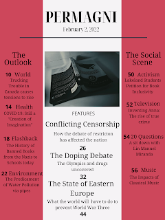
After deciding what mock up I was going to use for my final table of contents, I decided to get some feedback regarding how I could improve my design. I received a variety of suggestions with most of them focusing on two aspects of my design: the formatting of the articles and the fonts used. I decided to use some of these suggestions to see if they would work well.
Suggestion One
The largest suggestion I received from my peers was to edit the formatting of articles. One of the structures my peers proposed is displayed below. I was intrigued by this design. So, I tried it out in my Table of Contents. When I did so, I did change the justification of the article titles to left justified in order to make implementing this formatting a bit easier. When I did so, my Table of Contents looked much cleaner and easy to read. I decided to keep this suggestion as a part of my Table of Contents due to its effectiveness. Not only did it improve the design of my Table of Contents as a whole, but it really helped elevate the design. This suggestion was one that went with the conventions of my genre as well which influenced my decision.
Suggestion Two
Another suggestion I received from my peers was to edit the fonts I used in the format of my articles. The specific suggestion I got was that I should make the font of the topic heading and the page number the same bold font and have the article title in a different font. I implemented this suggestion and it was a massive improvement. Along with the improvement from the first suggestion, all of the articles were much easier to read. The flow and layout of the design improved immensely, leading with me keeping this change. When looking back at Time Magazine's table of contents, I realized that this is what they did as well. I looked at other magazines after this and realized that this, in some magazines, is a convention as it allows for the article titles to pop.
Suggestion Three
A third suggestion I received from my peers was to play with the red stripes and maybe make them a gradient. I implemented this suggestion and it did make my design a bit less bold. This was a good suggestion but the color of the stripes no longer went with my color scheme. I played with it a bit longer, decreasing the transparency and looking for other shades of red that would be a bit more gentle. I just could not get the color to match my color scheme as well, so I decided not to include this change in my final Table of Contents. This suggestion did not align with my genre as well, which influenced my decision regarding its use.
Conclusion
Taking these suggestions provided me with a different perspective on my design. These perspectives really helped me improve my design and make it both effective and user friendly. I, as explained earlier, am implementing suggestions one and two as a part of my Table of Contents. Due to the feedback I received, my design is much more sophisticated and sleek. It better matches the conventions of my genre and made my design much better overall. My next step is to now start work on my two page spread.


Comments
Post a Comment