Introduction
As I progress, I have decided to start drafting the cover of my magazine. There are a few ideas I have which involve the masthead, cover image, and more. I plan to have a magazine that is not completely conventional. Throughout this blog, I will be exploring some ideas that are conventional to an extent. These designs are not set in stone and will change as I continue to work on this project. To create these designs, I first created paper sketches of what ideas I had. I then used a design platform known as Canva to create my designs digitally. Some terms you will need to know are masthead (which is the title of the magazine), main cover line (the title referring to the feature story), the cover image/ main image (the image on the cover of the magazine), and coverlines (the titles referring to some of the stories features in that issue of the magazine).
Design One

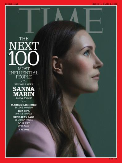
My cover starts with the masthead. Sticking with the conventions of my genre, I would like to have a masthead at the top of the cover. For the masthead, I was thinking of incorporating Latin as I find that it will help create an intellectual, knowledgeable brand image. In the draft to the left, my masthead is the word nunc, which is Latin for the word now. The font of the masthead will be the same as the draft, a formal serif font, inspired by Time magazine's masthead and the font used by the title of the New York Times. For my cover image, I want to go for an extremely unconventional approach. I assumed that this magazine would be tracking something over time, may it be a movement or a war. So, I want to create a word image that incorporates important quotes and statements that are connected to the topic. Splitting the cover in half, is a timeline that tracks the progression of the topic being discussed. In the middle of the timeline is a circle. This circle is a placeholder for a symbol or mini image that defines the topic. My main cover image was inspired by a Time magazine cover that used a collage of words to show how gun violence has been getting worse. Underneath the symbol and timeline will be the main cover line. It will not be in the font displayed in the draft. This will be in all capital letters, mostly likely in a more formal sans serif font. Underneath will be the subtitle for the main cover line, which will be in a Times New Roman style font. It will be in a smaller size and the use of a serif font will create a slight contrast between the main cover line and subtitle because of the different fonts types, not just the size. In the bottom left corner, will be the dates of the stories that the magazine is covering. This draft does not have a sell line because current affairs magazines tend to not have sell lines. This is usually because they want to seem more sophisticated, and sleek. They are trying to be more inconspicuous when drawing in readers. I decided not to place a price or bar code on the magazine as it is not extremely present in my genre.
Images of Inspiration
Some images that inspired this design are:
Design Two

This cover is one that is a bit less conventional with its masthead. Instead of the masthead being at the top of the cover, it is the center. I wanted to try having the masthead in the center because I would like to see if it will draw more attention to the magazine and be more effective. The masthead is one of the potential magazine names I am considering. It is permagni, the Latin word for today. I feel that using an ancient language will create a timeless, yet sophisticated atmosphere. The font of the masthead, keeping with conventions, is a serif font. Underneath the masthead is the main cover line, which is in a serif font as well. The main cover line is significantly smaller than the masthead. Underneath the main cover line is a subtitle, which is also in a serif font. The subtitle is a bit smaller than the main cover line. The main image is one that will match conventions to an extent. In the draft to the right, it is a tree with light peeking through it. I plan to have a vivid, dramatic landscape as the background of this potential cover. The picture will be a bit muted though so that the masthead, main cover line, and subtitle will still clear. I have decided to stick with only one cover line and subtitle as it keeps with the conventions of my genre. I want to keep the cover minimalistic and sleek. I do however want to create some contrast between the main image and the words on the cover, though I will stick to colors such as black and white. In the top right corner, is the date. This was inspired by Time Magazine and their date placement. I have decided not to include a sell line for two reasons. The first reason is that I feel as though it is a bit tacky and decreases the level of sophistication I am looking to convey. The second reason is that it is extremely unconventional in this genre. I did not include a bar code or price because most current affairs magazines tend not to have them on their covers.
Images of Inspiration
Some images that inspired this design are:
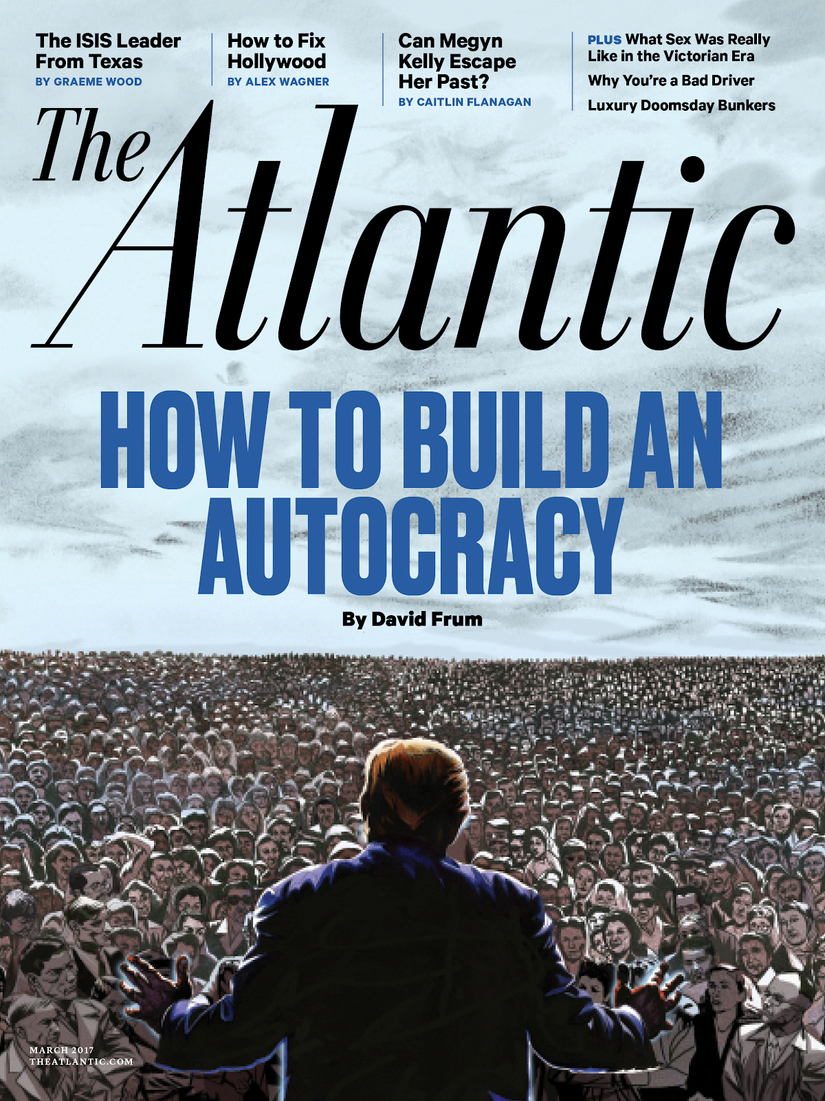
Design Three

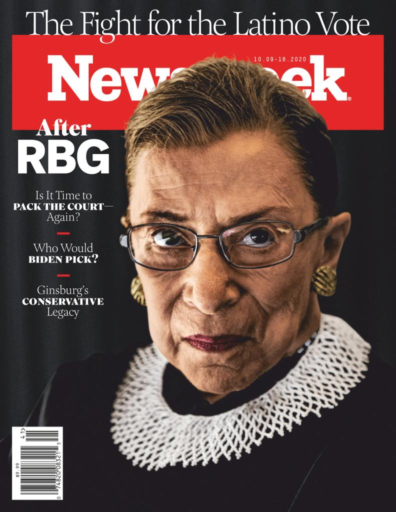
This cover is a bit different in comparison to my first two ideas. It, first of all, utilizes multiple cover lines, something I have yet to do. While I was researching, I realized that some magazines like The Atlantic do use multiple cover lines, but not in the way that magazines from other genres such as fashion do. I decided to try out this technique by placing a cover line above the masthead, a common trend I noticed for magazine covers that had multiple cover lines. I also placed the date in a different place. I noticed that magazines similar to Newsweek placed their dates above or below the masthead. I had a cover line above the masthead, so I placed the date underneath the masthead. My masthead's font was inspired by the font I saw being used by The New Yorker. It is a sans serif, more artistic font. For the rest of my written information on the cover, I utilized a serif font. For my main image, I decided to follow conventions, using a close up of a famous person (in this example, that person is Rosalind Franklin). For the positioning of the main cover line and its subtitle, I looked at the magazine that I thought used a similar cover image the most: Time. I noticed that they would sometimes have the main cover line to the right or left of the person being featured. Thus, I was inspired to place the main cover line and its subtitle to the right of the cover, underneath the head of the person being featured. I, as always, decided not to include a sell line as I have not found a sizable amount of current affairs magazines that have this. I did however decide to include a barcode. Upon further examination, I realized that magazines such as Bloomberg Businessweek and The Week included bar codes on their covers. In order to see whether or not I want to include a barcode in my final cover, I placed it on this draft.
Images of Inspiration
Some images that inspired this design are:
Design Four

This cover draft is one that is extremely unconventional. For the entire cover, I took inspiration from The New Yorker. I really found the cover of The New Yorker eye-catching due to its unconventionality. For my cover, I used a more informal, sans serif font for the masthead. I wanted to attempt to use a bit of a block font, similar to the one Newsweek uses in order to see what atmosphere it would help create. I attempted to make the masthead a bit more transparent so it blends in with the cover image but still can be clearly seen. I saw this technique used by Time magazine and found it extremely intriguing. I still need to work on the execution of this technique though. I incorporated one of my magazine title ideas into this draft. For the masthead, I used the word mundi, which is Latin for the word world. For the main image, I wanted to have an illustration, such as the one displayed in my draft. For the main cover line, I would like to incorporate it into the image like how it says "Happy Earth Day" in the illustration I used as an example. I do not want a subtitle in this cover though as I wanted to spotlight the illustration. On the topic of the main cover line, if it does not incorporate smoothly into the illustration, I do not think that I will not use it. This idea was inspired by the fact that The New Yorker does not use cover lines. The date is the top right corner as I feel as though that is a visually balanced place to locate it. I chose not to include a barcode or the price as I wanted to make sure that the image was what the reader saw and focused on. In addition, most magazines in this genre don't place their price and bar code on the cover though there are exceptions. I did not include a sell line as I have yet to find a magazine in my genre that utilizes one. This cover will have much more color than my previous few designs have had. I plan for the illustration to include at least one or two vibrant colors, taking a page from the New Yorker.
Images of Inspiration
Some images that have inspired this design are:
Design 5

This cover draft is extremely different from the ones I have previously designed. The main inspiration for the draft was Newsweek and Bloomberg Businessweek. I chose to make my masthead smaller than my main cover line as I noticed that Bloomberg Business had done this. I kept the masthead's font from the serif section, though I did use a sans serif font for the cover lines. I decided to include a massive main cover line as I wanted to see how to play out from a design perspective. I had noticed this technique being used by Bloomberg Businessweek and Newsweek, which made me a bit curious. I decided to include the subtitle on the left of the cover instead of underneath the main cover line as I noticed multiple issues of magazines such as Bloomberg Business using this technique. The font for the subtitle is the same serif font used by the main cover line, but without the font being in bold. I added multiple cover lines to this design as it is emulating Bloomberg Businessweek and Newsweek. I am thinking of having multiple cover lines for my final cover but I am not completely sure. For the main image, it is going to be a photograph of an item or a person (not in the form of a close up). I would like to use contrast in this draft, so if possible, the main cover image will have a dramatic pop of color. I tried to use an image that was mostly muted except for the red but my execution could be improved. I decided to include a barcode on the top right as I noticed that Bloomberg Business and Newsweek tend to have a barcode on the cover. I decided not to include a sell line because I feel as though it will take away from the sophistication that this design is trying to create by blatantly revealing to the reader that the magazine is attempting to gain more customers. Finally, I added the date underneath the masthead because I was inspired by the fact that Newsweek has its date next to the masthead.
Images of Inspiration
Some images that inspired this design are:
What I am Leaning Towards
The designs I am currently leaning towards are designs one and three. I am leaning towards design one because of its masthead. This masthead in its font style and placement is conventional for this genre but the title itself is unconventional. Pulling Latin in for the masthead I feel adds an extra timeless feeling that I could not get from some of the other designs. I also find that the main cover image is perfect for catching the eye because it is a picture made of words. The cover image puts together words and pictures to create an impactful, powerful design. I would like to base my magazine off a movement so this cover perfectly fits that purpose, providing me a creative platform to execute my idea upon. In addition, I still get to incorporate a conventional main cover line, subtitle, and date, creating a strong balance. This balance is taken further by the stark contrast between the black and white. Depending on the topic, I will edit the design as I go but I feel as though this is a strong place to start. Finally, it takes inspiration for my favorite magazine to read: TIME.
In addition to design one, I am also leaning towards design three because it is a mix of conventions I have seen throughout a multitude of different news magazines. It uses a more artistic masthead while still maintaining a sleek look. I was able to combine things I liked about other magazines into one design. I took the artistic masthead from The Atlantic, the cover image of a person close up from Time, the cover lines and subtitle placement from Bloomberg Businessweek, and the bar code and date placement from Newsweek. I also plan to incorporate the color of the New Yorker, though that is not visible in my draft. I feel as though design three is a reflection of what I have learned. It combines conventions I found intriguing from different magazines in the genre to create one finished product that is extremely effective at doing its job. I am not quite sure about which design I will end up picking but one thing is sure, I will be editing the designs and changing them as I continue to explore the world of current affairs magazines.
Works Cited
Gross, Rebecca. “50 Magazine Cover Design Tips to Inspire You | CANVA - Learn.” Canva, https://www.canva.com/learn/magazine-cover-design/.
Dolores, Delia. “The 10 Golden Rules of Magazine Cover Design.” Flipsnack Blog, 16 Dec. 2021, https://blog.flipsnack.com/how-to-design-professional-magazine-covers/.
Keung, Laura. “How to Make the Best Magazine Cover Design (& Learn The Anatomy of a Magazine Cover).” Design & Illustration Envato Tuts+, Envato Tuts, 26 June 2020, https://design.tutsplus.com/articles/how-to-make-the-best-magazine-cover-design-learn-the-anatomy-of-a-magazine-cover--cms-35126.
Bigman, Alex. “This Is How You Rock a Magazine Cover Design.” 99designs, 99designs, 24 Jan. 2018, https://99designs.com/blog/tips/how-you-rock-a-magazine-cover-design/.


Comments
Post a Comment